Transparency in design often seems so mesmerizing, if done right.
Today we will learn how to work with transparency in logo design.
Too much or too little of anything can make your good design bad.
Let’s see how we can avoid doing it.
We will cover:
- 2 Major challenges in transparency
- 4 solutions to create transparent elements
- Step by step instructions for you to do it alongside
Tip: Follow along the blog and create designs in your software.
Enjoy!
Topic 1:
What is transparency?
Transparency in design is nothing but the two or more overlapping elements that create a new element.
Remember the mastercard logo?
Take a look below.
Now the middle shape/element is an intersection of the other two.
I created one logo design for a brand name GoBoomerang.
The brand’s voice is to be joyful and reliable with the boomerang products to be delivered worldwide.
Keeping the brand’s image in mind helps you create designs that can speak for them.
The branding for that logo design took a week which included…
- All the meetings
- Client briefing
- Design prototyping
- And the handover of final brand guidebook
Take a look below.


Quick Read
- DesignModo has compiled 30 examples of transparent logos. You might want to take a look at it.
- Another great set of transparent logo design examples are provided by spoongraphics.
- If you want to add your logo design on different real life materials, Logaster explains it well here.
- Sarah from websiteplanet has explained the importance of having a transparent logo and why you should have one. Must read!
Topic 2:
Major Challenge
Instead of having a complex design method, I follow a simpler one.
Major challenge that I and many of my designer friends faced in our initial phase was…
To get the right color.
And to extract the overlapping color.
So I designed the logo but every time I tried to pick the overlapping color, I couldn’t.
See the issue?
Well picking the right overlapping color to create transparency effect is the key factor.
And more importantly, picking the right colors for your design.
After trying and testing 10 possible ways, we have come up with 2 best solutions for both.
They are easy and quick.
Let’s see the step by step instructions on how to work on them.
Topic 3:
Solutions
Pick the right colors
Solution 1:
Making the right color palette.
Color combination is a crucial factor in any design.
If you don’t have the right colors, you might end up sharing the wrong message.
Let’s see how we can fix that.
Pick two primary colors.
I am assuming you know about the color harmonies already.
If not, check out this quick video on color harmony and get back here.
Once the primary colors are picked, take one color from each of their sides and add it to your palette.
Great, now see if this palette works for your transparency design.
You see?
When you create your secondary colors on the basis of your own palette, the transparency comes out to be perfect.
If not, try out different color harmony. There are multiple types of it.
Solution 2:
Another solution to picking the right color is…
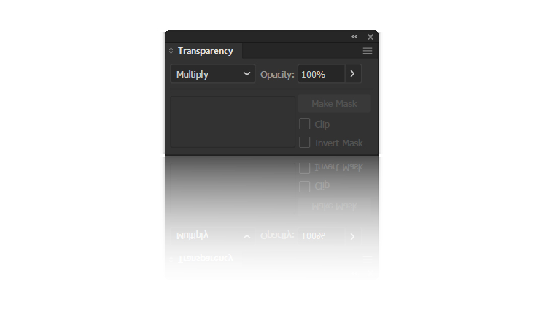
The transparency panel.
It seems like a small step but trust me on this.
Transparency panel gives you a lot of options on any overlapping element.
Try them out and it gives you the best middle color for your project.
Overlap your design elements.
Go to Windows > Transparency and click on it.
In the dropdown, you will find plenty of transparency effects that you can apply to your design.
Most of the time, “Multiply” works out just fine.
But if not, try out different options until you find the correct one.
Extract Overlapping Color
Solution 1:
Next up, we have the overlapping color picker problem.
So you have created the design with amazing colors from solution 1 or 2.
But you can not leave it to that.
Try splitting the shapes and see if the overlapping color stays.
It doesn’t, does it?
But you need all the elements separated in order to work on them by applying effects, features or anything else.
Sky’s the limit.
This is where our first solution comes.
Rasterize.
What is that?
We know Adobe Illustrator gives you the vector images.
But there is an option in Illustrator which can convert your vector design into a bit-mapped image.
This helps in complex designs when you need smaller elements to be converted in an image.
Coming back to the point, this gives you the ability to pick the overlapping color.
But make sure to keep a copy of your design.
Once we have all the colors, we will use pathfinder to split the shapes and apply specific colors to each element.
Solution 2:
Another solution that I came across is Blend.
Blend helps you see the middle colors between two primary colors.
What if you have 4?
In that case, we will pick all 4 and get the interim colors with blend options.
Not an Adobe user?
There is a simple trick you can use in any of the softwares.
Take a screenshot of your design.
Copy it and paste in your respective software project file.
Once you have that in your software, you can use the eyedropper tool or color picker tool to extract the color easily.
Thank you all for going through the entire blog.
Did you do it right? I am sure you did. Enjoy!


